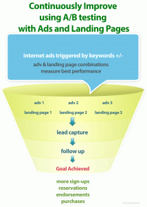
Many companies find it easy to forget about the most important factor in almost any internet marketing campaign: their landing pages.
Recent research from thousands of landing pages suggests that several relatively simple adjustments to existing landing pages can dramatically alter results.
Factors that offer the greatest improvement to almost all landing pages.
1. The Right Name for the Submit Button
Four different submit buttons were tested “Submit,” Free Consultation,” “Get Started” and “Next.”
- Both “Next” and “Submit” clearly yielded the best results.
2. The Right Headline for Each Page
It is important to understand what truly motivates potential customers before introducing a headline. The best headlines are short, tell a story and offer a clear value proposition simultaneously. The end user needs to understand the page headline almost immediately in order to gain their attention.
3. Limited and Simple NavigationLanding pages with less navigation options tend to perform better. There has to be enough content for users to quickly identify what a specific company is all about.
4. Keep Selling Points Focused
Short selling points are more effective than lengthy prose.
5. Have the Right Hero Image
This image is an aesthetically pleasing and easy way to break up text to make blocks of content easier to read and remember. It is important to refine the image to optimize the user experience.
In general, people sell. Images of happy customers or personified brands are almost always more effective than logos or images that are overly product-oriented.
The Little Things that Drive Conversion Rates
via Top 5 Landing Page Fixes and Upgrades – SEMrush Blog.
Related articles
- Optimize Your Landing Page With These 11 Tips (business2community.com)
- The Essential Landing Page Checklist: 16 Things You Need to Double Check (hubspot.com)
- Fix Your Website: 5 Things to Change Now (inc.com)
